Welcome to image alignment! If you recognize this post, it is because these are blocks that have been converted from the classic Markup: Image Alignment post. The best way to demonstrate the ebb and flow of the various image positioning options is to nestle them snuggly among an ocean of words. Grab a paddle and let’s get started. Be sure to try it in RTL mode. Left should stay left and right should stay right for both reading directions.
On the topic of alignment, it should be noted that users can choose from the options of None, Left, Right, and Center. If the theme has added support for align wide, images can also be wide and full width. Be sure to test this page in RTL mode.
In addition, they also get the options of the image dimensions 25%, 50%, 75%, 100% or a set width and height.

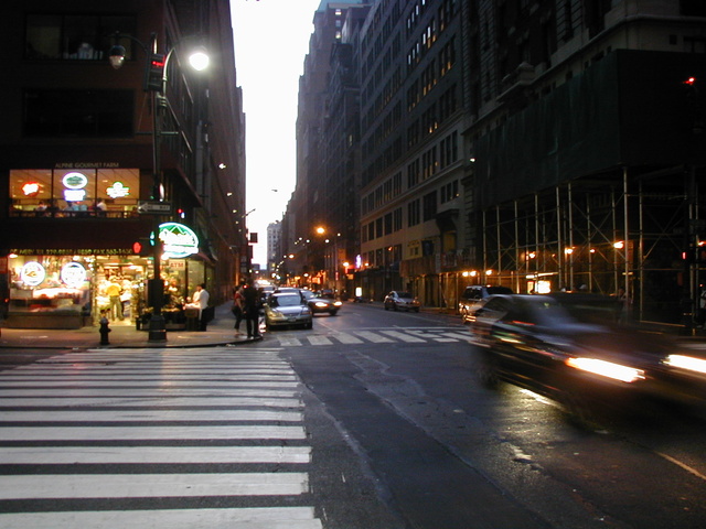
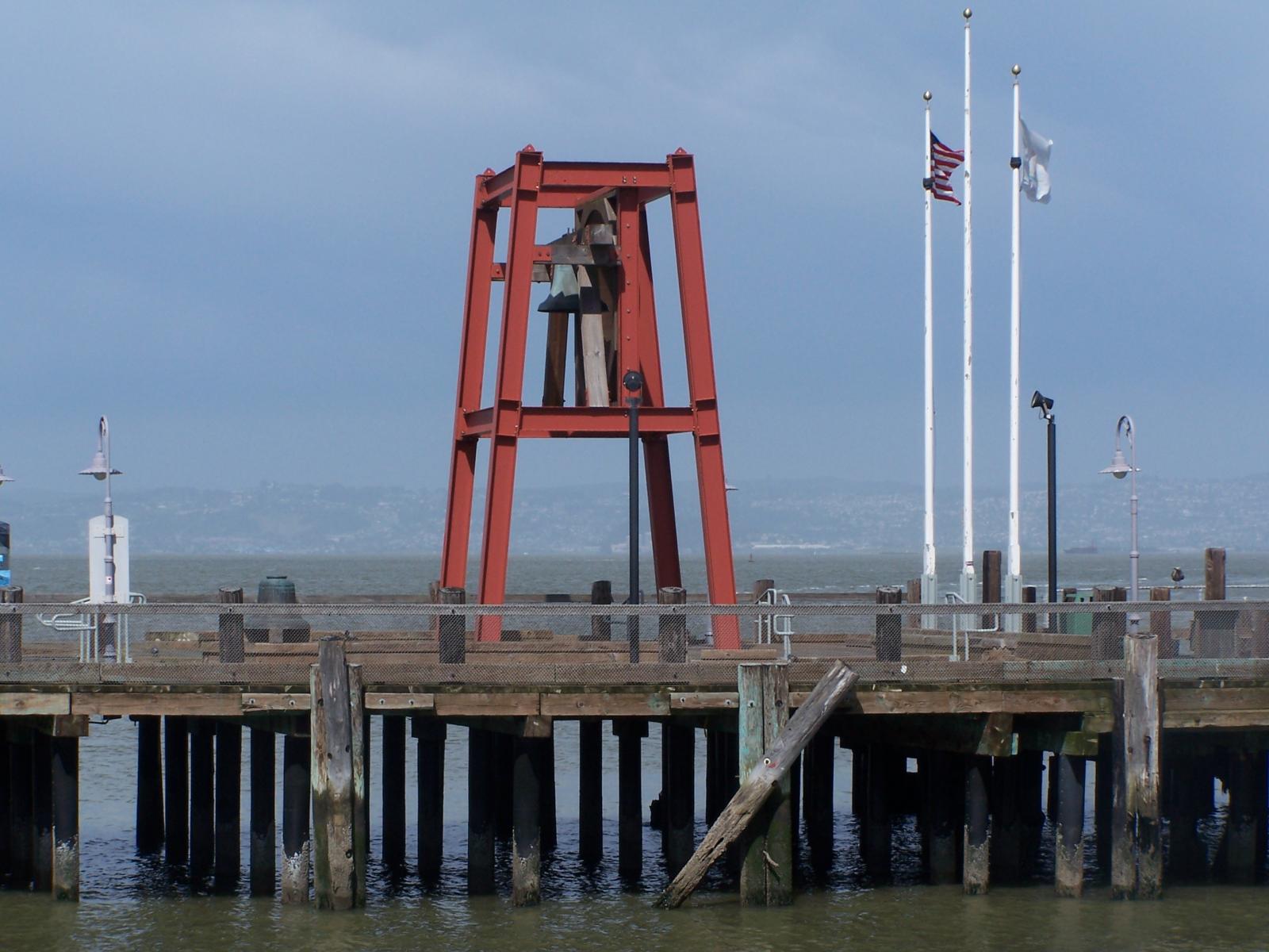
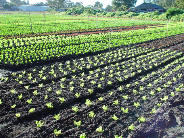
The image above happens to be centered.

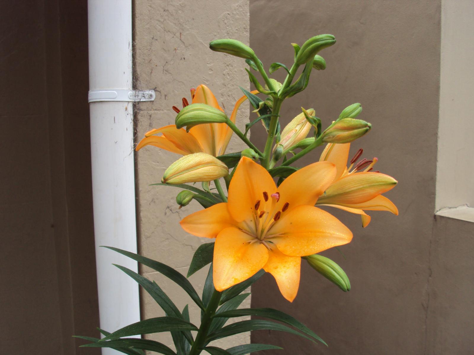
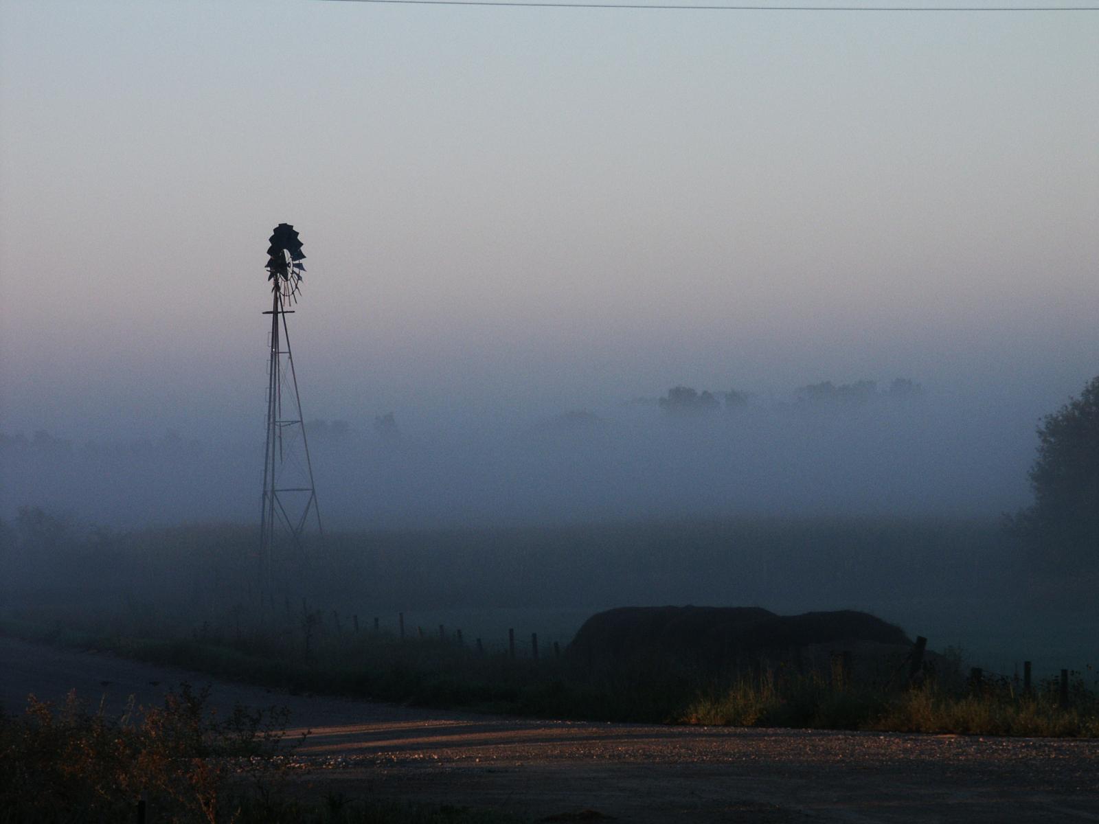
The rest of this paragraph is filler for the sake of seeing the text wrap around the 150×150 image, which is left aligned.
As you can see the should be some space above, below, and to the right of the image. The text should not be creeping on the image. Creeping is just not right. Images need breathing room too. Let them speak like you words. Let them do their jobs without any hassle from the text. In about one more sentence here, we’ll see that the text moves from the right of the image down below the image in seamless transition. Again, letting the do it’s thang. Mission accomplished!
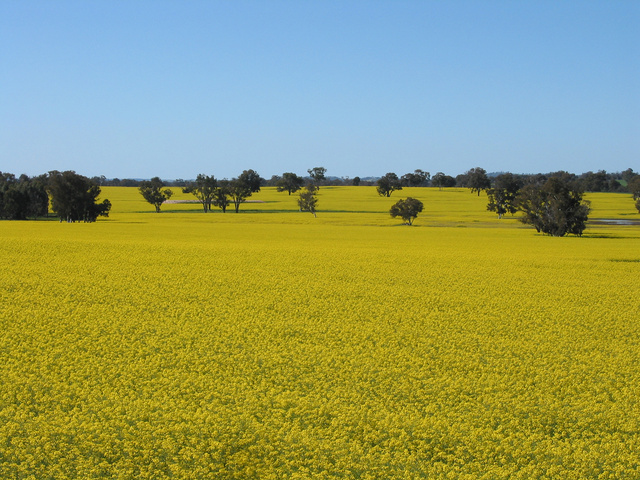
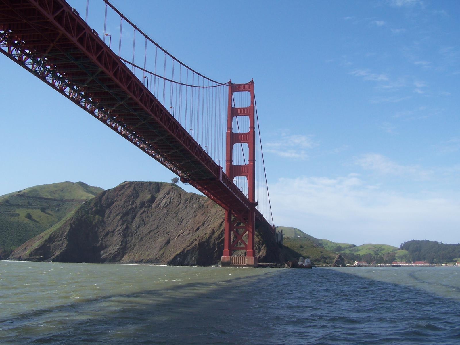
And now for a massively large image. It also has no alignment.
The image above, though 1200px wide, should not overflow the content area. It should remain contained with no visible disruption to the flow of content.
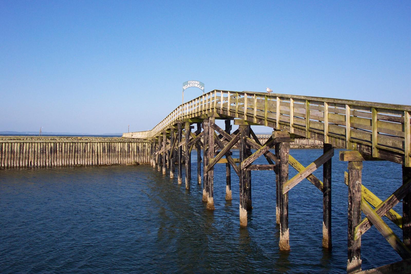
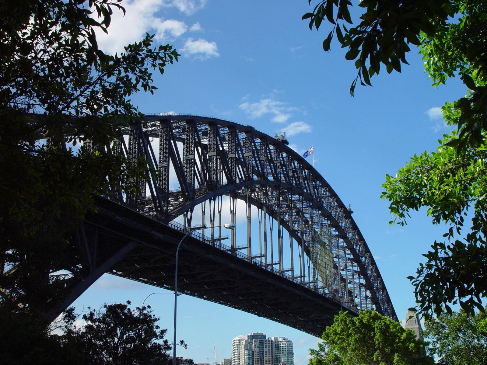
And now we’re going to shift things to the right align. Again, there should be plenty of room above, below, and to the left of the image. Just look at him there… Hey guy! Way to rock that right side. I don’t care what the left aligned image says, you look great. Don’t let anyone else tell you differently.
In just a bit here, you should see the text start to wrap below the right aligned image and settle in nicely. There should still be plenty of room and everything should be sitting pretty. Yeah… Just like that. It never felt so good to be right.
And just when you thought we were done, we’re going to do them all over again with captions!
The image above happens to be centered. The caption also has a link in it, just to see if it does anything funky.
The rest of this paragraph is filler for the sake of seeing the text wrap around the 150×150 image, which is left aligned.
As you can see the should be some space above, below, and to the right of the image. The text should not be creeping on the image. Creeping is just not right. Images need breathing room too. Let them speak like you words. Let them do their jobs without any hassle from the text. In about one more sentence here, we’ll see that the text moves from the right of the image down below the image in seamless transition. Again, letting the do it’s thang. Mission accomplished!
And now for a massively large image. It also has no alignment.
The image above, though 1200px wide, should not overflow the content area. It should remain contained with no visible disruption to the flow of content.
And now we’re going to shift things to the right align. Again, there should be plenty of room above, below, and to the left of the image. Just look at him there… Hey guy! Way to rock that right side. I don’t care what the left aligned image says, you look great. Don’t let anyone else tell you differently.
In just a bit here, you should see the text start to wrap below the right aligned image and settle in nicely. There should still be plenty of room and everything should be sitting pretty. Yeah… Just like that. It never felt so good to be right.
Imagine that we would find a use for the extra wide image! This image has the wide width alignment:
Can we go bigger? This image has the full width alignment:
And that’s a wrap, yo! You survived the tumultuous waters of alignment. Image alignment achievement unlocked! One last thing: The last item in this post’s content is a thumbnail floated right. Make sure any elements after the content are clearing properly.